
ENG


Design and Visual Language


Texture
And Imagery
And Imagery
Color
System
System
Typography
The design doesn’t imitate folklore — it reinterprets it with respect, precision, and artistic intention.
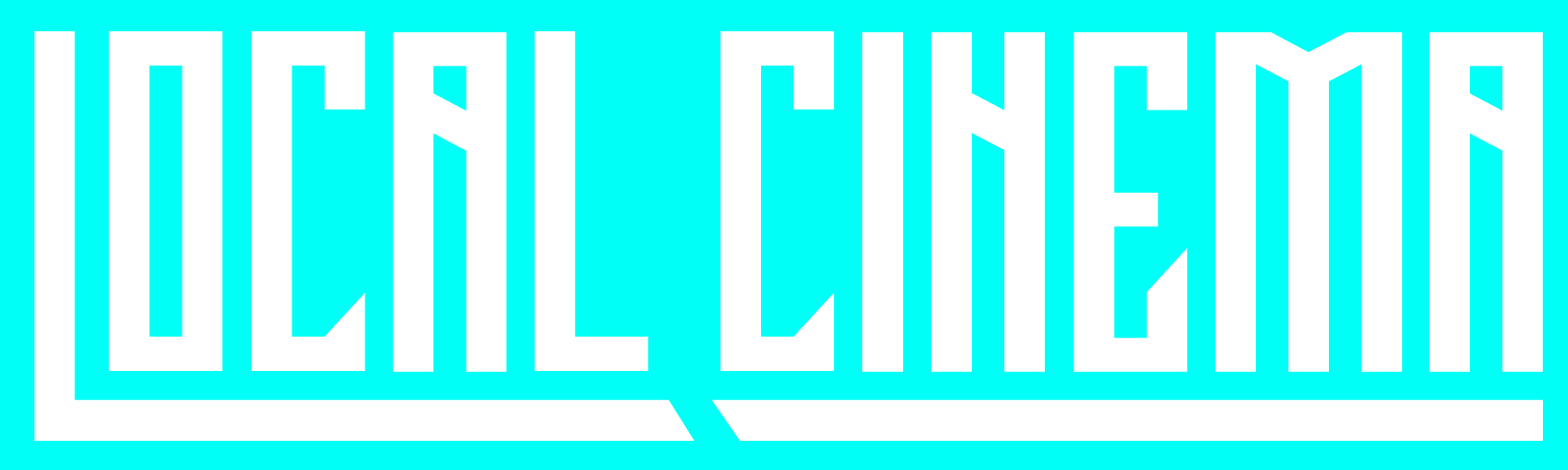
Our custom BURYAT typeface, developed from the shapes of ancient Mongolian-Buryat script, forms the core of our typographic identity. Headlines carry cultural weight, while supporting fonts maintain clarity and minimalism.
Background textures and graphic elements reference traditional materials — fabric weaves, carved patterns, natural surfaces — integrated in a modern, subtle interpretation. Photography focuses on authenticity and human presence, echoing our mission to reclaim narratives.
Earth tones, deep contrasts, and shades inspired by Buryat landscapes — steppe gold, lake blue, charcoal earth — create a grounded, cinematic palette.
Our design is deeply rooted in Buryat culture while speaking the language of contemporary cinema. The visual identity merges tradition and modernity: textures, symbols, and forms inspired by Buryatia create a cultural backbone, while clean layouts and modern digital aesthetics bring the brand into the global creative space.


BURYAT
typeface
typeface


The logomark is built on the letters “L” and “C” from Vagindra, a variant of Old Mongolian script, but they are stylized. Together, they form a geometric silhouette that evokes not only a temple but can also suggest other shapes, creating a versatile symbol that connects to heritage and spirituality while maintaining a bold, modern identity.

LOGOMARK
Texture
And Imagery
And Imagery
Color
System
System
Typography
The design doesn’t imitate folklore — it reinterprets it with respect, precision, and artistic intention.
Our custom BURYAT typeface, developed from the shapes of ancient Mongolian-Buryat script, forms the core of our typographic identity. Headlines carry cultural weight, while supporting fonts maintain clarity and minimalism.
Background textures and graphic elements reference traditional materials — fabric weaves, carved patterns, natural surfaces — integrated in a modern, subtle interpretation. Photography focuses on authenticity and human presence, echoing our mission to reclaim narratives.
Earth tones, deep contrasts, and shades inspired by Buryat landscapes — steppe gold, lake blue, charcoal earth — create a grounded, cinematic palette.
Our design is deeply rooted in Buryat culture while speaking the language of contemporary cinema. The visual identity merges tradition and modernity: textures, symbols, and forms inspired by Buryatia create a cultural backbone, while clean layouts and modern digital aesthetics bring the brand into the global creative space.
BURYAT
typeface
typeface
The typeface reinterprets the vertical writing system into a horizontal composition, evoking carved wooden tablets, sacred architecture, and inscriptional forms. BURYAT forms the core of the brand’s typographic identity: headlines carry cultural weight and character, while supporting fonts ensure clarity and minimalism.
BURYAT is an exclusive headline typeface developed specifically for Local Cinema.
It is based on traditional geometric Buryat patterns and also references Tibetan square script. Its characters are structured as elongated pillars with rhythmic strokes and geometric forms, creating a sense of balance, stability, and strength.
It is based on traditional geometric Buryat patterns and also references Tibetan square script. Its characters are structured as elongated pillars with rhythmic strokes and geometric forms, creating a sense of balance, stability, and strength.
A a B C D E F G H I J K L M N O p P Q r R S T U V W X y Y Z
Typography


